Sunday, August 30, 2015

Stamp-affaire - Red Carpet Finale


What a day!  We had so much fun racing through all the challneges and we are now experts on uploading and cajoling our Ipads and internet connections to get photos on our blogs and get them linked up with the PTI blog.  And you could just hear the brains humming with ideas and darting about looking for different colors, shapes, sentiments, tools  and techniques.  

Saturday, August 29, 2015

Stamp-affair #7 Runway Inspiration


This time we took inspiration from various runway shots of deigner outfits and gowns along with a list of colors,  This was proably the most painstaking card of the day as many of the pieces are inlaid die cuts. Teensy tiny die cuts.  I'm ready to crash and finish tomorrow!

Pins, Needles and Stitches


Three different tchniques here.  Melissa Phillip's stick pin and one of her darling tiny tags which is dangling from the sentiment.  And Heather Nichol's sweet stamp set: Stamped and Stitched.
It's 8:30 already, which is why I combined all three into one card.  I think I'm going to go change into my comfy jammies!

Stamp-affaire #7 Unconventional Materials


DuckTape

We had a budget of $10 to spend at a hardware store for things to use on one of the greeting cards for the day.  I found this Duck Tape and was sure my pal Barb would use it because she loves all the Mackenzie Childs stuff.  Lo and behold, Barb went in another direction and I thought this would look so cool with one of the sentiments from Lunchbox Love.  Speaking of lunchbox, it's time for some food we picked up from the Deli during our afternoon break.  

Stamp-affaire #6 Mixing Colors


NOW it looks better!!

5PM.  We've been at it now for 10 hours.  Now it's time for a break.  We are supposed to make  card combining a color we love with colors we rarely use.  I hardly ever use "Winter Wisteria",  "Plum Pudding" or "Royal Velvet".  I rescued it with some Zig Clean Color Pens.  When I finished it, I thought it looked dreadful.  However, a splendid California Chardonnay and some crackers with 
Saga Blue Cheese is making this look a lot better!

Stamp-affaire #5 - Mixing Patterns


This challenge was to use a mix of patterned papers that we got in our SFA supply kit.  I thought I knew exactly which ones were my favorites and suddenly found myself going in another completely different direction!   I fussy cut a section from the large rose print to accent the wreath.  And the sentiment from "Choose Joy" fit perfectly into the oval inside my little wreath.

Stamp-affaire #4 Bakers Twine


Challenge #4 is to use Bakers Twine on a card.  The creative process is humming, Barb and I are experiencing long minutes of dead silence as the brains are working, punctuated by 
hystercial laughter as we scramble to find things, paste things, cut things and get it all posted!

Stamp-affaire #3 Patterns


Challenge # 3 started at 9AM.  this time it was to use a pattern to create your card.  I chose #11 because you could use watercolor techniques to create the bold stripe, contrasting that with a horizontal sentiment.  It was just too much fun to color the leaves instead of leaving them as white accents.  Added a  touch of detail with a black Multiliner pen.  

Stamp-Affaire #2 White Wedding Challenge


We were up by the time the first challenge came up this morning at 6:45:  Make an all-white wedding card, using texture and neutral color for the sentiment.  Total scramble through the dies I brought and cut a bunch before I chose the ones that might work.  I gave the heart and the birds extra dimension by layering them.  Not too much bling.  Just one pearl seemed to do it.  

Friday, August 28, 2015

Stamp-affaire #1 Friday evening


It's the Eve of PTI's Stamp Affaire!

First challenge was to make a card with the new "Fashion Sense" stamp set.  I was aiming for contrast between the formal, guilded lines of a French Renaissance mirror in a showroom versus a fanciful 
Silk gown.


Sunday, August 2, 2015

Birthday Cupcakes


My grand daughter's birthday is coming up and I wanted to make something special.  This card opens up to form a cute little "box". The cupcakes fit in perfectly.  A lot a little pieces to put together, but it turned out perfectly! Had to show this one off!


Patterned paper: My Favorite Things
Cupcakes: PTI Bakers Dozen stamps & dies
Watercolors:  Zig Clean Color Pens
Box Template:  thepapercut.com

Tuesday, July 7, 2015

MIM 217 Making your own borders


This was a fun challenge--  I used the stamps and dies from PTI's "Oopsie Daisy" along with some bright color, changing my daisies over to zinnias instead.  The "border" was created with the smaller daisy dies and all were colored with my Zig Clean Color pens.  These pens have such fabulous
bright intensity and can be shaded so beautifully.  I find myself reaching for them whenever I have the chance!  And I adore the sentiment.  Who couldn't use a card like that from time to time?

Cardstock:  PTI vintage cream
Images:  PTI Oopsie Daisy, Lunchbox Love
Dies:  PTI Oopsie Daisy
Color:  Zig Clean Color pens - yellow, pink, orange

Monday, June 29, 2015

MIM 216 Adding Color to Coverplates


Today's Make It Monday challege was to use a large die (known as a coverplate because it is usually sized to cover most of the front of a typical A2 sized card) and color it.  I've already used the peony coverplate which was displayed as an example quite a few times, so I looked for something different and came up with these stars!  July 4th will bere before we know it and turning them into firewoeks seemed perfect.  I wish the sparkles on them showed up more, but still they are pretty against a twilight sky.  Used my Kuretke Clear Color pens for the strars.

Card stock:  PTI Stampers Select White
PTI inks for the sky: Lemon Tart, Orange Zest, Melon Berry, Spring Rain
Stars:  Kuretake Clean Color pens, Wink of Stella plus glitter

Thursday, June 25, 2015

Make It Monday #215


This challenge was about bringing the inside of a card out to the front by means of a window. My brand new Kuretake Clean Color pens just arrived and so I went on a hunt for an image that I could use them with right away.  The sunflower is from one of the PTI Botanical Blocks set and it was perfect for some vibrant color!  

Wednesday, June 17, 2015

PTI June Blog Hop


The principal colors for this challenge were grey, orange and a touch of green - on a photo of a pair of what I would call "capezios" (dating myself; that's what we called flats with cute fowers in the 50's).

So I picked the cute flowers as a focal point along with an elegant graphic with a grey background.
I did the sentiment in grey also - love this quote from Audrey Hepburn!  A few sparkles and it seems just right.

Paper:  PTI Stampers Select White, Watercolor paper for the rosebuds
Dies:  PTI Rose; Delicate Details
Ink/Color:   Kuretake watercolors for rosebuds, Grey ink  for sentiment and flower outline


Wednesday, May 20, 2015

Make It Monday 212 -Fussy Cutting


Fussy cutting is such a funny name for a basic technique!  But it does make sense when you see it in action.  It's a way of precision trimming around an image or a sentiment by moving the paper instead of your scissors. I always used to just eyeball how close to make my trimming, but Ashley Cannon-Newell showed us such a great trick:  to first do some tracing with pencil around the area to be trimmed.  So simple!  And it makes the process of fussy cutting much easier.  I used this process on the "Thanks" and paired it with an equally bold rose which was heat embossed in white and colored with a variety of yellow/gold toned Copic pens. 


Cardstock: PTI stampers select white
Sentiment:  PTI Thanks All Ways
Image:  PTI Rose
Various Copics

Monday, May 4, 2015

Make It Monday #211


The challenge:  to use gelatos for a softened background effect.   I decided to turn my "Mums the Word" stamp set into peonies instead.  Just for fun, now that I have a Misti, I tried using Sweet Blush ink.  I rarely use it because it is so pale, it just doesn't show up on a card.  But this time I stamped multiple times with the Misti and I really liked the effect.  By the time I added the leaves, it was clear that a monochrome background with a subtle pink gelato was the best choice. 
I'm not usually one for subtlety, but this just seemed the right way to go.
-- added a hint of accent with translucent sequins, and done.

Image:  PTI Mum's The Word
Ink:  PTI Simply Chartreuse, Sweet Blush
Paper:  PTI Linen Cardstock
Gelato:  Faber-Castell pale pink

Tuesday, April 28, 2015

Make It Monday #210


This Monday' challenge involved using vellum.  I'm really glad I gave it a try!  Often I make cards where the visual image is the most important and while I want to add a sentiment, I don't want it 
compete with my artwork.  After watching the video I realized that vellum could be the perfect answer for these situations!  Even better, I had a roll of vellum adhesive that has been sitting one of my drawers for a good year or more-- unused.  And it really works!  Doesn't show through the vellum, which I heat-embossed with silver embossing powder.

Cardstock:  PTI Select White, Hibiscus Burst, Vellum 
Sentiment:  PTI Get Well Wishes
Die: PTI  Peony Coverplate
Thermoweb vellum adhesive 

Thursday, April 23, 2015

PTI April Blog Hop - Inlaid Peony


Inlaid Peony

This month's theme was pink and navy.  I love this PTI coverplate of a peony.  I've used it several times with watercolor, but this time I thought I would use navy cardstock as the background, then add the white cutout from the coverplace and then inlay two shades of pink cardstock.  I love the dramatic design!  It seemed anti-climatic to add a sentiment, though maybe a tiny one in the left corner would work.  My friend Betty has more than 30 peony bushes in her yard, and when they come into bloom, I get to take home the most wonderous and fragrant bunches of these luscious flowers!


Die:  PTI Peony coverplate
Cardstock:  Enchanted Evening, Hibiscus Burst, Raspberry Fizz, Select White (all PTI)
Embellishments:  PTI rainstones

Monday, March 23, 2015

Make It MONDAY #206


Today's challenge was to create a mix and match series of stamped papers and use them on a card.  This challenge really lends itself well to having some abstract stamps like dots and border stamps which I don't have many of --but I decided to give it a try.  My dotted paper came from two sets of stamps and so did the bold print.  The little flowers come from Petite Pots, and the  banner dies came from Bakers Dozen.  Quite a hodge podge of stuff.  all I can say is thank God my card-making pal and great friend Barb taught me to keep an inventory notebook of stamps!


Inks: Hawaiian Shores, lemon Zest and Hibiscus Pink
Images: Songbird, Meadow Greens, Petite Pots, Brushed Blooms, Funky Florals
Various Copic pens for flowers

Monday, March 9, 2015

Make it Monday: Watercolor Smooshing


OK so "watercolor smooshing"  is a technique where you apply ink to a clear acrylic block that usually holds a polymer stamp.  No stamp this time; instead you spray the color with water and apply to your paper, "smooshing" it a bit to blend the color.  I did a couple of try-sies and found that it really works best when the paper is also a bit damp.  I make a lot of motivational cards and thought "Leap Of Faith" with gold embossing would be great for this one with a vellum butterfly.
A few well-placed sequins to pick up these lovely pastels, and done!

Ink:  Summer Sunrise, Hibiscus Burst, Aqua Mist (all PTI)
Paper:  PTI Aqua Mist, Vintage Cream, Lemon Tart
Butterfly Die Cut:  Life Is Beautuful (PTI)

Tuesday, March 3, 2015

An Asian inspired Birthday Card.


Last year I was at a papercrafting convention and came across a single packet of Asian rice paper that looked a lot like silk brocade -  I only recognized it because I spent part of my childhood in China, and I saved it for special projects.  This photo doesn't do it justice, because there are bits of gold accents sprinkled among the flowers.

My sister Penny was born in China and is celebrating her birthday - a perfect occasion to get out this unique paper and turn it into an Asian-inspired birthday card.  In China, gold and red are the colors of good luck and prosperity, so in addition to the gold accents on the paper, I added the gold sequins and a gold-embossed "happy birthday" tune.  My sister has a great bird feeder on her porch and whenver I come for a visit we have a great time bird-watching from the kitchen table as well as on our walks in the woods.  So of course I added this bluebird, a symbol of happiness.  It picks up the bits of blue in the rice paper too!  And when we were growing up, the color pink was assigned to Penny by our Mum.  Pink sheets, Pink dressess, Pink bedroom!

Happy Birthday, Penny


Monday, March 2, 2015

Make It Monday #203


I happened to be playing with the new Anniversary set from PTI yesterday and it turned out to be today's challenge:  adding a "sketchy" quality to images with a black multiliner pen.  I do this often on cards where I've spritzed the color with water to create a watercolor effect.  It gives a lovely and casual hand-painted look.  Natural twine finshes off these pots of flowers.


Cardstock:  PTI White Select, Classic Kraft and Dark Chocolate
Image:  PTI Petite Pots
Inks:  New Leaf, Simply Chartreuse, and Ripe Avocado with Hibiscus Pink, Blueberry Sky and Winter Wisteria
Various Copic pens and a Copic Black Multiliner pen

Wednesday, February 11, 2015

PTI Anniversary Challenge - Metallics


Oh all these challenges have been so much fun!  Today's was to use neutrals and metallics, so I used Cream, black and Kraft cardstock.  I know that one of my kids will be celebrating some sort of achievement or another, so the idea for the card was a no-brainer!  I had some leftover metallic gold paper from Christmas - I bet this card would be even better with the new metallic cardstock that PTI is coming out with this month.  The garland comes from "Rustic Wreath" which I chopped in half, reminiscent of a crown of victory.   

  I love the boldness of this design- could be for a guy as well as for a triumphant gal.


Cardstock:  PTI Vintage Cream, Clasic Kraft, True Blac
Die: PTI Rustic Wreath, Un-Corked
Sentiment:  PTI Hip Hip Hooray

Sunday, February 8, 2015

PTI Anniversary - Day 4 Bouquet


If it has anything to do with flowers, I'm in.  Today's challenge was to create a bouquet using flowers from 3 different stamp sets.  I started hunting for some  and thought I'd try a few out on a mockup piece of cardstock.  It went together so fast that my real problem was in being sure that all these teensy flowers got returned to the right set!  I used second generation stamping for the leaves.  This one's a keeper.


Stamp Sets for flowers: (allPT
Cuppa Love
Birds & Blooms
Embellished Elegance

Sentiment:  PTI Birds and Blooms

Saturday, February 7, 2015

PTI Anniversary Day 3 - Å gift & a tag


Today's challenge was to create a tag for a gift bag.  I did not have a gift bag around so after 3 failures, ( I haven't used it for at least 6 months) I figured it out and made a gift box with the We Are Memory Keepers scoring device.  Makes a perfect box to give someone a set of handmade greeting cards and  envelopes.  

Next was the tag.    :- (    I really don't have any tags and added that to my PTI wish list.  BUT I am so proud of myself!  I figured out that I could make a darling tag by taking the PTI bookmark die and shortening it to make it into a sweet tag!


Inks:  PTI Aqua Mist and Limeade Ice
Images:  Garden Grace
Sentiment:  Songbirds

Friday, February 6, 2015

PTI Anniversary Challenge - Day 2


Today's challenge was to take one of designer Maile Belle's projects as a source of inspiration.  I think the "Life Is Beautiful" Butterfly is my favorite for 2014 and I paired it with "Watercolor Wonder", another of her stamp sets.  

 This card took a lot of painstaking prep work.  I did a partial die cut for the Butterfly (that took a couple of tries)  and then experimented with the right colors for the butterfly wings (a few more try-sies), and the splash of watercolor inspiration. I LOVE how the watercolor splash came out  with 3 shades of color.  I found the sentiment and added a sprinkle of sequins.  

Inks:  PTI True Black, Harvest Gold, Summer Sunrise and Orange Zest
Paper: PTI Stamper's White Select, Orange Zest
Images:  PTI "Life Is Beautiful" (and Die) , "A Little Inspiration", Watercolor Wonder

Thursday, February 5, 2015

PTI 8th Anniversary Challenge


Today's PTI challenge was to choose a set of colors and a sketch to create a card.  I'm definitely in the mood for springy colors, using New Leaf, Classic Kraft, Summer Sunrise, Hawaiian Shores, and Raspberry Fizz.  My personal challenge was to use some stamps I haven't used in a while.  

Mighty Oak came up and one of the quotes on this stamp set - about going out on a limb - inspired this card.  The image is split in two:  one side with the traditional green leaves and the other side, further out on the limb, in vivacious colors.  I used generation stamping to create more depth and to keep the colors balanced.  Otherwise the Raspberry Fizz would have taken over.  Love this sentiment and the way the card picks up that theme of "going out on a limb".

Images:  Mighty Oak
Ink: New Leaf, Classic Kraft, Summer Sunrise, Hawaiian Shores and Raspberry Fizz
Paper: PTI Stampers Select White, Hawaiian Shores

Monday, February 2, 2015

Make It Monday #200 - Layered Die Cuts


Today's MIM challenge was to use a coverplate diecut to create a shadow effect.  What intrigued me was the idea of using mutiple cuts in different colors from the same die.  I wanted to use the Art Deco die as the coverplate, but it didn't lent itself too much to a true shadow effect since it is so architechural.  Nevertheless, it does look great with the alternating cardstock colors.  I continued this layering effect with the leaves and the darling bird from the Songbird die set.  

It's dreary here in St. Louis!  I wish we would get some snow-- it keeps going just to the north of us.  This little card is cheerful and sunny.  Spring is on its way.


Cardstock:  PTI Hawaiian Shores,  Spring Leaf, Limeade Ice, Lemon Tart, Hibiscus Pink
Sentiment:  PTI Birds & Blooms
Dies:  Song PTI Bird and Art Deco

Thursday, January 29, 2015

Clean & Simple Class - Stitched Image


Another day where I have some time and the right stuff to follow along with Day 4 of the Clean & Simple Class.  I was intrigued by Jennifer McGuire's video on converting a stamped image over to a stitched one.  I found a fairly simple flower (a tulip)  on PTI's stamp set "Cuppa Love", stamped it on typing paper and used that pattern to punch in the stitching holes.  Then the stitching with embroidery floss.  I used a tapestry needle for the actual sewing.  I'm glad I tried this technique!  

Wednesday, January 28, 2015

Clean & Simple Class


The Clean & Simple class has been going on for two days and today I finally had the inspiration and the time to try out one of the techniques - creating an inked background and adding Versamark accents. And - another opportunity to add one more to my stash of Valentine cards.  

I used two of the Distress Ink minis for the background and then stamped various sizes of hearts on the background.  The Versamark didn't seem to show up very well, so I added accents with my Wink Of Stella pen. Much much better. I also was glad to have a chance to make a partial die-cut with the large heart.  Very simple card - I like it!

Tuesday, January 20, 2015

Make It Monday 198 (front side)


This week's Make it Monday challenge was to make a tri- fold card.  I was looking for something to put on the front flap and thought some sort of banner might work. I used the "happy" one liner and clipped off the edges.  The flowers came from "Oopsie Daisy"; leaves from "Pretty Petals."  It still looked kinda boring so I added some pearl embellishments.  The inside is what really pulls this together.  I made a gift envelope to match and die-cut the word "Birthday" from the same Rasberry Fizz cardstock.  All PTI


I love the inside!  I finally used the "Type Strips" I made a couple of weeks ago.  The die-cut gift card envelope matches the front of the card.  

Saturday, January 17, 2015

Connecting the Dots


I read an interesting article about creativity this morning on a blog called "The Unbound Spirit".  The author pointed out something that made so much sense to me because I realized that when I'm in my studio I do this all the time --but I never gave it a name.  He said that a part of the creative process is the ability to just be willing to start out and "connect the dots".  This card is a perfect example. 

I've been making Valentine cards and came across this die for the word "love".  I thought it would look pretty if it was made out of watercolored paper in shades of pink to a vibrant red. (Kuretake Gansai watercolors of course.)  I made this word one evening when I was bored and not particularly inspired and the "love" laid around on my desk for a few days, as I was not sure what I would do with it.  I happened to be thumbing through my collection of dies for another project and came across this lacy and intricate die from PTI and the dots just connected.  The delicate and elegant die-cut balanced the bold and colorful word "love" perfectly!  

This is not the most technically sophisticated card, but there's great beauty to be had in some very simple things, don't you think?  


Cardstock:  PTI Stampers Select White
Die:  "Love" Simon Says Stamp, Lace "Delicate Details" PTI


Monday, January 5, 2015

Make It Monday 196


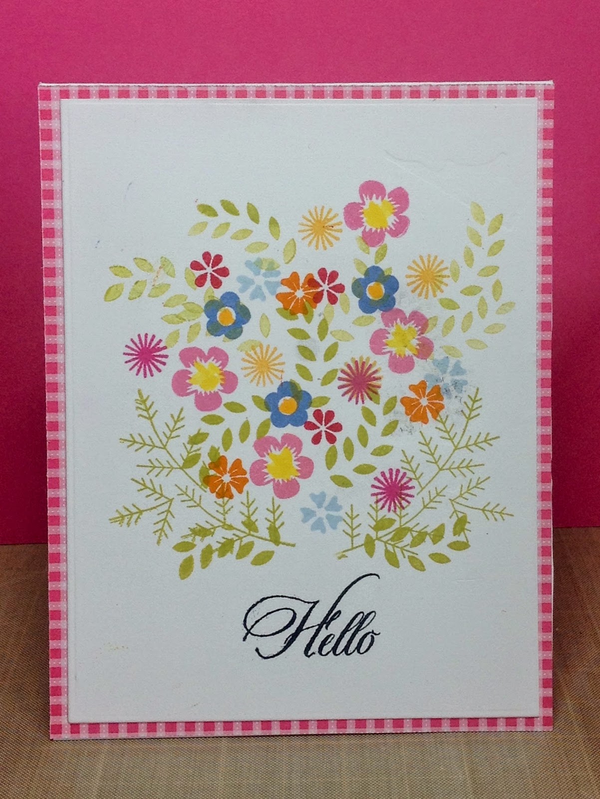
Ahhh.  Life must be geting back to normal.  I think this is the first time I've had the time and/or focus to tackle a Make It Monday challenge since last October.  Today's challenge was to create a card with the emphasis on a corner element.  I used the leaves and flowers from PTI's Embellished Elegance, and to make them fit right, I .....actually cut them apart!  Much better.  I took the leaf element and used it as an echo effect for the background, stamping it in Soft Stone ink.  

This was my 3rd attempt. After trying to include watercolor elements and a larger stamped background I concluded that with these deliate flowers and leaves, it was best to keep things simple!  Adding too much would've made it muddy and cluttered, as in my first two attempts.


Paper:  PTI Stampers Select White, Limeade Ice
Ink: Simply Chartreuse, Limeade Ice, Hibiscus Pink, Rasberry Fizz
Images:  PTI Embellished Elegance, Think Big Favorites #22

Sunday, January 4, 2015

On its way to Austria


The other day I received an elaborate Christmas card from the Austrian Student who stayed with my daughter's family for the school year in 2014.  She went to the trouble to find a very fancy card with all kinds of embellishments that really looked hand-made, and she took the time to write the sweetest note to me.  Our major adventure together was a trip to Onondonga Caves where we explored giant underground caverns with a Park Ranger.  We had the whole place toourselves because we arrived in the late afternoon and I'm sure it was the longest single walk that I'v done since the two hip replacements.

You never know how much your actions will affect another person.  I was so surprised and deeply touched by her words of appreciation --and that amidst all the social and holiday activity that would surround a 17-year old, she still took the time to get the card and write to me.

This card above is the one I'm sending to her.  Yes, watercolors again.  How I love pure color and what you can do with watercolors.  Looks perfect for a teenager!

Paper: PTI Vintage Cream, Aquarelle Arches watercolor paper
Ink: Ranger Archival Black
Image:  PTI Big Hugs
Kuretake Tambi watercolors