Friday, November 18, 2016

Exploring Watercolor - Lesson 2 - A Pear


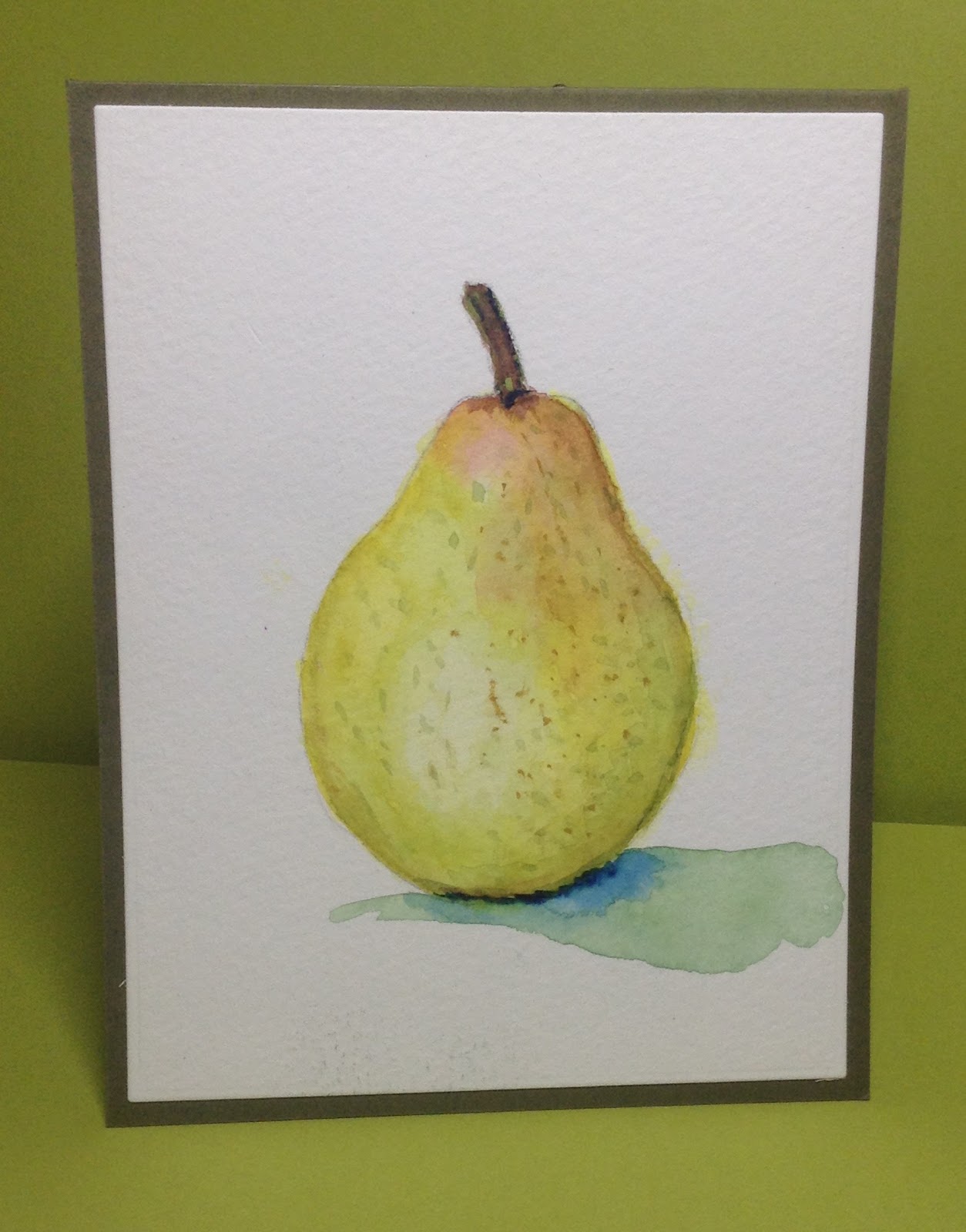
I confess I still haven't figured out how to get an Instagram photo shared on to Sandy's Instagram Page, so I'm just going to load this up on to my blog.  I finally got an evening of peace and quiet to work on this lesson and I think the biggest thing I'm learning is to let the water do it's own work!
There are a few lines that I'd prefer not to have, but all in all I'm happy with this.  I love the looser quality of this painting!  Thank you Sandy!  Your videos are mesmerizing!

Saturday, November 12, 2016

Exploring Watercolor Class 1 With Sandy Allnock


I am so excited about Sandy Allnock's class!  When I first heard  about it, I called up my sister who lives in Minnesota and recently started watercoloring for the first time over the past year,  I thought it would be so much fun to take this class together.  And we've had such a great time sharing this experience with each other!  I was first introduced to watercolor lessons as a 12-year old and have been painting by instinct; my sister has taken formal lessons.  Both of us have learned so much, which is a testament to Sandy's talent as a teacher.  I learned all about glazing and the technical intricacies and properties of paint.  I'm happy with my oranges - love how the texture of the skin shows up, thanks to all those layers of color.  Can't wait to start the next class class - a pear.

Saturday, July 23, 2016

Color Blocking - a la Andy Warhol


Color Blocking - the last project of the day.  This time I did take a few short cuts.  We'd been at it for  around 15 hours and I was not up for exact and precise measurements etc.  I die cut my soup cans and used Copics to do the backgrounds.  I'm pooped!  We took a selfie with some of our cards and were laughing hysterically.  It was such a fun day, dashing around, hunting down stamps, dies, papers and every kind of glue and tape and watercolors and inks and Copics!  And we made some good cards along the way.


Watercolor is my favorite medium and this was so much fun and easy to do.  Kay Miller did a lovely job with her first "official" video demonstration.  I followed the basic color scheme, but chose some brighter shades of pink and green.  This is one of my favorites, for sure!

Mastering Drips and Splatters


I love abstract art!  This challenge was to create something in the style of Jackson Pollock.
Lots of splats and dribbles.  I had to work on my patience to let one layer dry before I applied another!  Lots of fun!

Georgia O'Keeffe Inspiration


The 2PM challenge was "Masterpiece Recreation" - my eyes went to Kay Miller's card, based on Georgia O'Keeffe.   I love large floral designs.  I also used watercolor and then I superimposed the Peony coverplate over it.  I liked the contrast between the loose watercolors and the firm design of the coverplate.  

Floral Impressionism


Melissa Phillips' designs are always such an inspiration for me.   My friend Barb and I actually have coined the phrase, "I'm going to Melissa this..."  Which always means going 4 or 5 star steps with more laters, more textures and more colors and more embellishments!

This was a mad dash for us because there were so many layers etc.  

Starry Night


The Challenge for this hour was to create a starry night sky, inspired by a Van Gogh painting,  When the video for this challenge was finished, we both had the Kleenex out!  It was so beautifully done.

I loved how this one turned out and I coouldn't add any thread or sequins,  I think it would have taken away from from the beauty of the sky,  I was very fortunate to have recently visited my sister Penny, where we played a lot with watercolors. Penny showed me some techniques about  watercolors and sky.  

Friday, July 22, 2016

Let the Stamp Affaire Begin!!


My best friend Barb and I have been counting the days to Stamp Affaire --and here it is at last!  

The first challenge was to choose a color recipe. Mine contained Hawwaiian Shores, Tropical Teal, Berry Sorbet, Melon Berry and Harvest Gold.  We could see that all the color sets were designed to take us out of our comfort zone.  Melon Berry is too dull for me so I just used it for the center of one flower and focused on the Harvest Gold.  I used Copics for the sentiment.  I didn't think I'd like this at all, but now I think the design is pretty good

Monday, March 21, 2016

Make It Monday #243 Blending over Heat Embossing


Today's challenge was to use ink blending over heat embossing.  After watching Danielle's video, I started looking for some "words" to emboss and the set from "Choose Joy" begged to be used for a get well card for my niece, who is facing a very long recovery from a serious ski accident.  I'm always amazed at how things just seem to "fall together"!  The main sentiment arrived from "Lunchbox Love". Yellow is my favorite color - especially the new Bright Buttercup and I am loving these these new stencils.  (All from PTI). This one is going in the mail tomorrow.

Sunday, February 21, 2016

Sandy Allnock Paint Along Watercolor Class


How amazing that you can take art classes on the internet!  I've been following Sandy's class this past week and finally had the time free to do a watercolor with the basic set of Daniel Smith paints.   I was surprised at how intense the pigments are.   A teensy dab will do it.  And this whole picture was done with only 3 colors.  I love mixing colors and my biggest challenge is in being subtle enough with it all.  It's amazing how much you can pick up just watching Sandy and listening.  I haven't done waterolors seriously since I was about 12 or 13 and I'm loving this!

Wednesday, February 17, 2016

Make It Monday 239


Today's "Make It Monday" was about customizing patterened paper and Lizzie Jone's use of polkadot  patterened paper gave me the idea for this card.  

Yellow. Pink and green sure looked perfect for an Easter card.  I used PTI's  "Hippity Hoppity" stamp and die set, along with Copic pens for extra color.
this was a fun card to make!


Sunday, February 14, 2016

Paper Crafting Alphabet


This was such a fun challenge, -another one from Papertreyink's Birthday Celebration.
The challenge was to choose elements of your card, based on the letters of your name.  
Based on that, my elements were:

P = Use Pink somewhere in your project (the flowers)
O = Incorporate some kind of ombre effect (watercolored background)
LL = Lean your sentiment at an angle ( Thank You )
Y = Incorporate a shade of yellow

This was really fun!  (Though I admit I had to fuss with it a lot before 
I came up with the final results.). 

I used the "Branched Out" die to make a stencil and create the backgroound leaves.  The flowers are from "Vintage linens" and the framis is from the "Sprinkles" dies collection. I added a sketch-y quality with a black Sharpie pen.


A PTI Thank You Card

L


Lots of contests on Papertreyink this week, celebrating their 9th anniversary!
The challenge for this card was to make a "Thank You" card for the staff that packs and ships all our stuff so beautifully and efficiently.  I used PTI's Black and White paper with the outline design already applied.  Next was a die (Enclosed: Present) to create the gift and the tag.  I added the great big gold bow from the same set.   And a few touches of flowers with Copic pens.


Sunday, January 31, 2016

Another set of Flowers


I was really taken by this example presented in the class -- it looked perfect for a sympathy card I wanted to make.  I loved the misty quality and the diagonal composition. And now I keep a scrap piece of watercolor paper nearby to test strokes and pigment with before I apply my brush!  

This is the best class ever and I'm learning so much about brush techniques!!

Saturday, January 30, 2016

Day Five - Expressive Flowers and Leaves


This was the best of the bunch!  I'm catching on to the brush strokes; used a larger brush and did better with layering color.  This is one of those cards that would be hard to send away!

Day 4 - Watercolor Class


This was a practice session on using brush techniques to create depth.  It actually came from a larger piece of watercolor paper.  I chopped off a section that looked OK and made it into this card.  My biggest challenge is to keep things from getting muddy by applying too much pigment too early,  After I finished the card I went in and removed some from the flowers so they'd have more depth.


Day one -Watercolor Class


Wow!  A new watercolor class for card makers has started.  I loved the first one I took a year or two ago.  It was so inspiring - and this one is nothing short of AMAZING!  I knew quite a bit about working with watercolor as a medium and mixing and blending colors, but this is on a whole new level for me because so much of it is based on the use of what I would call Asian-inspired watercolor techniques that are based on using pure brush strokes to create imagery,  First thing I had to do was go out and get some more brushes.  

This exercise was about creating an ombré effect using a flat brush and blending/bleeding two colors together.  I used it to create this simple but dramatic card with a butterfly and a few sequins for accents.